5 mins read
Improved e-commerce conversions by 139%, while cutting cart abandonment by 40%.

Role
UX Designer
Timeline
3 months (design + iteration)
Core website revamp executed within 3 weeks
Skills
Design Thinking
UI Design
Shopify (with platform constraints)
Overview
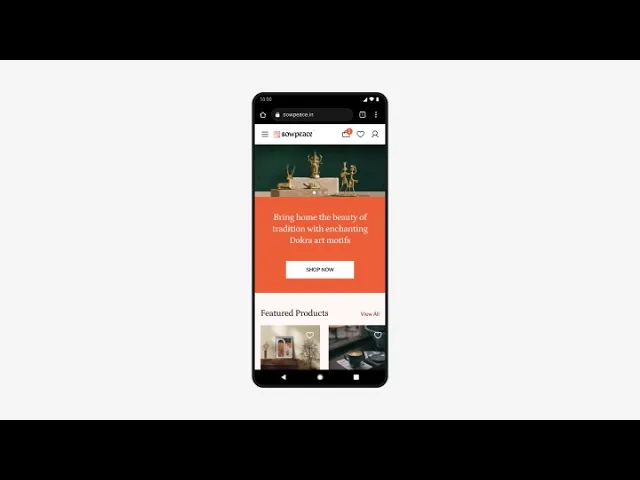
Sowpeace is a Shopify-based home décor marketplace for handcrafted products by Indian artisans.
While the brand and products resonated with users, the website struggled to convert traffic into purchases. The experience leaned heavily on aesthetics and discovery, but users often hesitated at key decision points.
Within tight timelines and Shopify constraints, this project focused on reducing friction without compromising trust, resulting in a 139% increase in sessions converted, and more.

The Problem
Despite decent traffic from marketing campaigns, the website showed:
Low session-to-purchase conversion
High cart abandonment
Drop-offs during checkout
Because the site was already live, we couldn’t afford a long redesign cycle. We had to learn fast, ship fast, and iterate post-launch.
What We Measured
To keep decisions grounded, we focused on four metrics commonly tracked in early-stage e-commerce:
Conversion rate (sessions → purchase)
Cart abandonment rate
Average Order Value (AOV)
Bounce rate
These were tracked using Shopify Analytics and Hotjar.
Understanding the Users
Surveys (30 respondents) + User Calls (Qualitative Insights) + Competitor Scan
What influenced purchase decisions the most:
21 out of 30 users (72.4%) said clear product information strongly influenced their decision
17 users (58.6%) looked for positive customer reviews before purchasing
14 users (48.3%) said discounts or promotions mattered, but less than clarity and trust
11 users (37.9%) looked for trustworthy payment options and transparent company information
10 users (34.5%) said easy checkout didn't matter, but showed up strongly in abandonment reasons later

What users told us:
“I keep re-checking everything once I reach the cart.”
Many users felt uncertain at the cart stage and went back to product pages to reconfirm details, pricing, or offers. This back-and-forth often led to abandoning the purchase altogether.“It looks nice, but I’m not fully sure about the quality.”
Especially for handmade products, users wanted more reassurance: reviews, proof of craftsmanship, or signals that others had bought and liked the product.“Checkout feels longer than I expected.”
Even when users were willing to buy, the number of steps and screens made the process feel heavier than necessary.“The page takes a bit too long to load on my phone.”
Image-heavy pages caused slight delays, which broke momentum, particularly for mobile users on slower networks.
We reviewed similar Indian and global home décor brands to understand common conversion patterns. A few themes showed up consistently:
Trust elements appeared early: often on product pages, not just checkout
Lightweight cart experiences were preferred over full-page cart interruptions
Delivery timelines, returns, and payment details were clearly visible before checkout

Design Strategy
Instead of redesigning everything at once, I focused on removing friction at key decision points.
The idea was simple:
Help users feel confident earlier and ask them to do less later.
What We Changed
Replaced Heavy Cart Page with Quick View
Since products weren’t spec-heavy, I introduced a Quick View flow:
Users could review price, quantity, offers, and trust elements without leaving context
Reduced “second guessing” caused by full cart redirection
Improved Product Pages
We updated product pages to answer common doubts upfront:
Clearer image hierarchy
Highlighted essentials (material, size, care)
Visible delivery and order-tracking info
Trust badges placed closer to action buttons
Navigation & Discovery Improvements
Introduced a mega menu for quicker category access
Added better filters (price, category, material)
Reduced time spent hunting for products
Simplified Sign-in & Checkout
Reduced visual noise during checkout
Ensured payment options were clearly visible
Streamlined form fields within Shopify constraints
Before development
Before pushing to dev, I tested the checkout prototype with 5 users:
3 found it very easy
2 felt neutral
No major blockers surfaced, so we moved forward.

The prototype
Iteration After Launch
During a short pause between marketing campaigns, I made small but intentional tweaks to the product page:
Moved offer information above CTA buttons
Shifted product details below trust elements
Added a dedicated trust-building section

Outcome
~20% increase in conversion rate during the second campaign window
Lower cart abandonment compared to the previous campaign
Improved AOV trend (aligned with industry averages for décor e-commerce)
Data compared across two marketing periods using Shopify and Hotjar.

The impact
Sessions converted
139%
Cart abandonment rate
40.5%
Avg. order value (AOV)
17%
Bounce rate
28.6%
This was the change over a period of 3-4 months. All done with small, well-timed design changes that resulted in a measurable business impact.
Other Projects

